
|
The shapes I chose in this project, were altered versions of different recognizable shapes. I used these shapes because they flowed well into each other, and I wanted to see if any of my class mates would interpret the shapes as I intended (the left shape is a flame turned upside down, the middle shape is a guitar, the upper right shape is an arrow pointing down towards my last shape which was another flame that is turned right side up) I used the flipped the flames in order to compliment one another and create a scene of balance. Throughout this project I slowly learned to "let go", to try new things, and work a little bit out of my comfort zone. Before this project I have never used a Sharpie as my main utensil. I would get frustrated when it was not working the way I intended it to, but I quickly learn how to fix my mistakes; and with some of my mistakes I'm more satisfied with the final outcome as opposed to my original plan!
|

I enjoyed doing this project more than I anticipated, it was quite a challenge to imagine a figure shape-shifting in five little tiles. At first I was completely stumped about what I could do for the assignment. I eventually decided I wanted to do something that has to do with my love for music, so I drew a music note, and actually worked backwards, the pieces just kind of fell together. I found it easier to make curvilinear shapes out of sharp edges, rather than vise-versa. The problems I ran into during the duration of this project were similar to the ones before, the sharpie was not a consistent black so I had to put down two to three layers before I began to get the tone I desired. Overall I am happy with this piece. Another issue I ran into was the medium I used; After about two straight hours of working with sharpie I began to feel nauseous, and got a headache, so multiple breaks were needed!

This project seems pretty overly simple at a glace, but it was actually quite difficult. This was the first project that I have done digitally for this class, and I'm glad I did because the computer allowed for crisp/clean and straight lines, the proportions are extremely accurate! In completing this project I learned how effective something so simple could be. I learned how to work with positive and negative space to create a visually pleasing composition. I learned there are endless variations of compositions that could be created with a minimal amount of shapes. I gained a deeper understanding for the principals of design as well. Very few problems emerged throughout the duration of this assignment, all went as planned!

The purpose of this assignment was to create the illusion of overlapping planes using strictly value and line weight with only a white colored pencil. We were instructed to let each plane within the picture have a different pattern; we were allowed to have more than one of the same pattern though. This project was by far the most tedious artwork I have ever done and extremely repetitive at times. The tediousness of it made it very time consuming and often frustrating for me, I am not one who likes repetition at all. As for the medium, I haven't touched a colored pencil since freshman year of high school, so you could go on to say I was "rusty". However in doing this project I learned how to blend in mistakes to benefit the composition as a whole, I learned that not outlining each plane makes for a cool effect that looks as if they are on top of one another, rather than sitting side by side, connected, like a puzzle. The to add value to certain areas, really pushed the depth of the composition. Even though that was the assignment, I really didn't understand what it meant until I finished.

This assignment was my very first time ever working with screen printing. The assignment entailed the entire class cutting out random shapes and textures of paper and arranging them in a composition, and then creating a few silk screen prints. There was a different screen for each color used. The next step of the assignment was to take a piece of paper and overlap the different prints. Then when that was completed we were told to cut the composition into a minimum of six little rectangles and paste them onto a folded booklet. I decided to throw India ink at the white piece of paper in order to complement the back ground of my prints. And for the cover I just took the other rectangle scraps and cut random red shapes and pasted them directly to the folded white piece of paper. I enjoyed this project because it was the first time I ever got the chance to work with printmaking, and all in all I am satisfied with the final outcome.


|
This project was more difficult than I anticipated due to the fact that I have never really attempted abstract art before, and i found it quite challenging to make not one, but two abstractions. However, in doing this assignment I learned how to effectively break down an organic figure into basic shapes in order to create a unique abstraction. The final abstraction was the easiest, we were told to pick one of our abstractions and photocopy it, then cut and rearrange it into a entirely completely new composition. I find it interesting how a completely new work of art could be easily created using that same artwork. All in all I feel like this assignment was a success, and I'm satisfied with the final outcomes. |


|
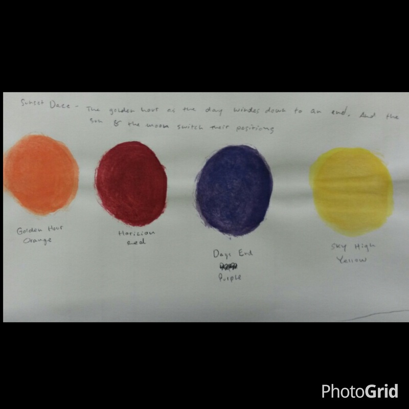
This project was the first of our color theory research, which was a rather simple assignment, all that was asked of us was to create a color wheel using only cut-outs from magazines. I choose to do mine in a less traditional color wheel format, and spell out the word of the color using different tints and shades of that particular color. This assignment was the second project of our color research project, we were instructed to simply create and fully label a color wheel that blended each color into the next. The second component of this assignment was to take a color and create a tint and shade spectrum using only that color, black, and white paints. This was the third component of the color research project, and all that was asked of us was to create a color swatch, write a creative description regarding the swatch, as well as cleverly name each color. (the description can be found in the "Galleries" tab under "Art 102 Extras") The final project of our color theory research was to create a poster board of the psychology and history of the color we were assigned. (a small list of the research found in doing this project can be found in the "Galleries" tab under "Art 102 Extras) This project was really interesting due to the fact that I was rather oblivious to the influence colors have on our human psychology. |


|
I really enjoyed this project, due to the fact that it involved a lot of self-reflection, the guidelines were very relaxed and we were allowed to do basically whatever we felt resembled ourselves, despite the fact that it was required to be done digitally. The assignment was simply to create a logo that we felt resembled our selves. The meaning behind my logo is basically the fact that I am constantly thinking, My "gears" are always turning and I'm pretty much always lost in my thoughts. Hardly ever to I verbalize what is going on in my head. I am a very reserved individual that likes to keep to myself. This was the second component of the logo project, the assignment was simply to create a business card that we could distribute that had the logo we had created on it, a way of getting in contact with me, as well as a link to our website. I find this project to be the most helpful due to the fact that networking is a major component in the world of art, and with out being assigned this project I would not have the incentive, let alone the idea, to create a business card for myself. This was the third and final component of the logo project, the assignment entailed us finding three objects to put our logo onto. I chose to put it on a lighter, a DVD, and a wine bottle. |
|
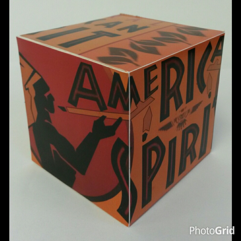
For the final project of this course we were instructed to find a product packaging that had many visual elements. After taking multiple photos of the packaging, we were then told to re-create the packaging in the form of a three-dimensional cube using Photoshop. The elements of the cube were supposed to carry on from one side of the cube to the next, making it view-able from every angle. This project came together smoother than I anticipated, I ran into fewer troubles than I did with the previous digital assignments due to the fact that I am more familiar with Photoshop than I am with Illustrator. Overall this project went smoother than I anticipated, and I am satisfied with the final outcome of this project. (more photos could be found in "Galleries" tab under "Art 102 Projects")
|
